How to create a three-column layout with HTML & CSS (YouTube Clone - part 3)


Welcome to this lesson which is a part of a series of tutorials to build a YouTube Clone unlike what you have seen before.
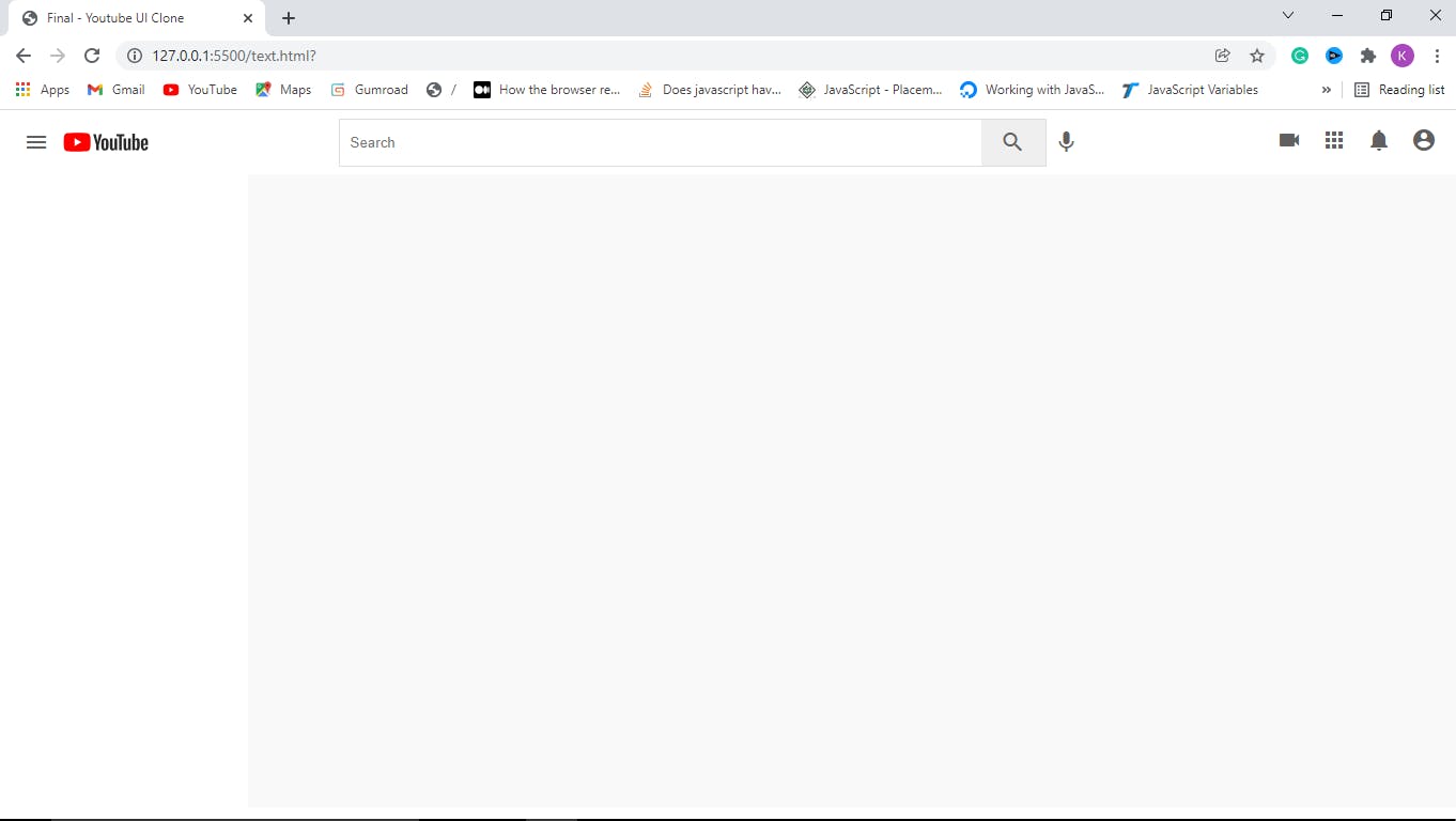
In this lesson, we are going to discuss how to divide an element into sections. In short, we are dividing the header section of the YouTube clone into three sections which are left, center and right, and each of the sections contains some tags as in the below code:
Step 1: Adding children and grandchildren to the header
<header>

 <div class="logo left">
   <i id="menu" class="material-icons">menu</i>
   <img src="https://cdn.hashnode.com/res/hashnode/image/upload/v1641440730932/nXN3YLsqk.png">
 </div>

 <div class="search center">
   <form action="">
     <input type="text" placeholder="Search" />
     <button><i class="material-icons">search</i></button>
   </form>
   <i class="material-icons mic">mic</i>
 </div>

 <div class="icons right">
   <i class="material-icons">videocam</i>
   <i class="material-icons">apps</i>
   <i class="material-icons">notifications</i>
   <i class="material-icons display-this">account_circle</i>
 </div>
</header>
Do you know how to link files properly because of the image? If not, watch how to do it like a pro here.
After dividing the header into three sections by adding three separate blocks of code, it is time to use CSS to make it more beautiful. Let’s get started.
Step 2: Styling the left section
.left {
  display: flex;
  align-items: center;
}

.left #menu {
  padding: 0 7px;
  cursor: pointer;
}
Don’t forget, we set the justify-content property of the header to space-between, which means there will be equal space between every tag in the header.
Now, we gave a class left because it should be by the left and we set its display property to flex to create sections with layout out of it. Its children are aligned to the left-center of the header. We also access the menu that is inside the left section with its id.
We set its padding top and bottom to 0 and its padding left and right to 7px. Its cursor property is set to the pointer so that when the mouse is on it will show a pointing finger.
Step 3: Styling the center section and its form
.search {
  display: flex;
}

.search form {
  display: flex;
  border: 1px solid #ddd;
  height: 45px;
}
Hey! You should know what we do in the search class by now. We set its display property to flex so that we can create a layout with its children. We do the same to the form which is inside of the search/center section.
Its border thickness is set to 1px, type to solid and color to #ddd ( something silver or ash).
Step 4: Styling the input in the search form
.search input {
  width: 600px;
  padding:10px;
  border: 0;
  height: 100%;
  border-radius: 2px 0 0 2px
}

input:focus {
  outline: none;
  border: 1px solid #ddd;
}
We select the input which is inside the seach section with “.search input”. We set it border-radius: to 2px top, 0 right, 0 bottom, and 2px left. Then, what is border-radius? It is the curved edges of an object with four angles.
Step 5: Style the search and mic icons/buttons
.search button {
  height: 100%;
  width: 60px;
  border: none;
}

.mic {
  margin-top: 10px;
}
The button inside the search section is also selected with the “.search button”. Its height is set to 100% of its parent. We don’t want it to have any border so we set its border to 0.
We access the microphone icon with its class name “.mic” and set its margin-top to 10px so that it will move down a bit.
Finally, let's style all the material-icons we have on the web page:
  .material-icons {
    color: rgb(100, 100, 100);
    padding: 0 7px;
    cursor: pointer;
  }
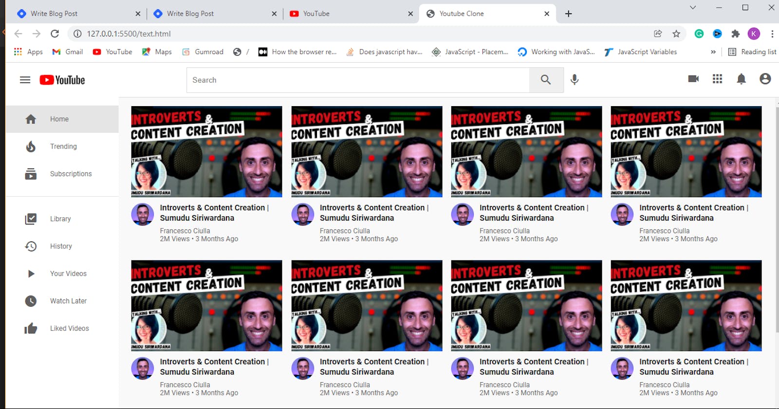
Hurray…We have added children and sections to the header of the YouTube clone. Check the final result below: