How to build a calculator with HTML and CSS( part 3)
How to use repeating linear gradient.
Welcome to this lesson, in this lesson, we are going to continue to build the calculator we started previously.
In the last lesson, I told you I would explain the style of the Sun battery. In short, we are going to explain the style of the sun-battery and also build the screen of the calculator in this tutorial, so let's get started.
If there is anything you don't understand in this tutorial, that means you probably need to read How to build a calculator with HTML and CSS( part 2).
Step 1: Adding a child to the screen-container
<!-- <div class="screen-container"> -->
      <p class="screen-mem">M</p>
      <input type="text" class="screen" name="screen" value="0"
          maxlength="10" disabled>
<!-- </div> -->
We added some HTML tags to the screen-container to represent the screen and screen memory. We added the disabled attribute to the input tag to make sure it cannot take any input.
Step 2: Adding multiple box-shadows
 .sun-battery {
    width: 106px;
    height: 30px;
    border-radius: 3px;
    background-color: #3d2115;
    box-shadow: 0 -3px 5px -3px rgba(255, 9, 9, 0.2),
      5px 0 3px -5px rgba(255, 255, 255, .8),
      0 2px 5px -2px rgba(0, 0, 0, .5),
      -3px 0 3px -1px rgba(0, 0, 0, .8),
      inset 0 -5px 3px -3px rgba(0, 0, 0, .5),
      inset 5px 0 5px -2px rgba(0, 0, 0, .8);
    background-image: repeating-linear-gradient(to right,
        transparent,
        transparent 26px,
        rgba(255, 255, 255, .1) 26px,
        rgba(255, 255, 255, .1) 27px);
  }
We set the width of the sun battery to 106px and height to 30px and we set its curved edges on all sides (left, right, top, bottom) to 5px. Its background colour is set to a kind of black with a blend of red.
The box-shadow in the style above/below has six shadows and we will explain them one after another.
 /*this still a part of the CSS code above */
   box-shadow: 0 -3px 5px -3px rgba(255, 9, 9, 0.2),
      5px 0 3px -5px rgba(255, 255, 255, .8),
      0 2px 5px -2px rgba(0, 0, 0, .5),
      -3px 0 3px -1px rgba(0, 0, 0, .8),
      inset 0 -5px 3px -3px rgba(0, 0, 0, .5),
      inset 5px 0 5px -2px rgba(0, 0, 0, .8);
0 -3px 5px -3px rgba(255, 9, 9, 0.2)=> 0 (no shadow by the right) -3px (shadow by the top) 5px(blur-radius) -3px (shadow inward spread) rgba(255, 9, 9, 0.2) and color with 20% transparency.5px 0 3px -5px rgba(255, 255, 255, .8)=> 5px(shadow by the right) 0 (no shadow by the bottom) 3px (blur-radius) -5px(shadow inward spread) rgba(255, 255, 255, .8) and white color with 80% transparency.0 2px 5px -2px rgba(0, 0, 0, .5)=> 0 ( no shadow by the right) 2px (shadow by the bottom) 5px (blur-radius) -2px(shadow inward spread) rgba(0, 0, 0, .5) and black color with 50% transparency.-3px 0 3px -1px rgba(0, 0, 0, .8)=> -3px(shadow by the left) 0 (no shadow by the bottom) 3px (blur-radius) -1px (shadow inward spread) rgba(0, 0, 0, .8) and black color with 80% transparency.
Before I explain the rest, let me draw your attention to something. Obviously, you can see all the shadows are copying and pasting with some basic editing.
The next two shadows are a bit different because we add another value of the box-shadow which is inset.
inset 0 -5px 3px -3px rgba(0, 0, 0, .5)=> inset means the shadow should be inside instead of outside as in the previous shadows. 0 (no shadow by the right) -5px (shadow by the bottom) 3px(blur-radius) -3px (shadow inward spread) rgba(0, 0, 0, .5) and black color with 50% transparency.inset 5px 0 5px -2px rgba(0, 0, 0, .8)=> once again, inset means the shadow should be inside. 5px (no shadow by the right) 0 (no shadow by the bottom) 5px(blur-radius) -2px (shadow inward spread) rgba(0, 0, 0, .5) and black color with 80% transparency.
Please make sure you understand the shadow above before moving to the next part because I will not explain the shadow again in this tutorial. Now, I am going to explain repeating-linear-gradient.
 /*this still a part of the CSS code above */
background-image: repeating-linear-gradient(to right,
        transparent,
        transparent 26px,
        rgba(255, 255, 255, .1) 26px,
        rgba(255, 255, 255, .1) 27px
);
transparent,
 transparent 26px,
repeating-linear-gradient does what it says to repeat a linear gradient. It repeats a linear gradient. The gradient here is meant to start from left to right.
transparent is the color and it is the starting point. transparent 26px means that the transparent color extends from 0 to 26px. It creates the rectangle we have in the sun-battery
rgba(255, 255, 255, .1) 26px,
  rgba(255, 255, 255, .1) 27px);
and another white color with 10% transparency starts from 26px and continues to 27px. It creates a vertical line that divides the rectangles.
Normally, the linear gradient creates a rectangular gradient with a line by its right side and a repeating-linear-gradient is used so as to repeat the linear-gradient up until the box is totally filled. That is it what creates the multiple rectangles in the sun-battery.
Step 3: Creating the screen of the calculator
.screen-container {
    margin: 20px 0 20px 0;
    border-radius: 5px;
    border-right: 1px solid rgba(245, 245, 245, .2);
  }
We select an element with .screen-container as its class name and set its margin top to 20px, right to 0, bottom to 20px and left to 0.
We set its border-radius ( its curved edges) on all sides to 5px and its border to its right to 1px, a solid line with somewhat white color with 20 percent transparency.
  .screen {
    background-image: linear-gradient(-155deg, #44443a 0%, #656f66 100%);
    width: 100%;
    display: block;
    border: 0;
    text-align: right;
    font-size: 40px;
    margin-top: -20px;
    padding: 10px;
    font-family: 'Share Tech Mono', monospace;
    letter-spacing: -2px;
    border-radius: 5px;
    box-shadow: 0 -4px 4px -3px rgba(255, 255, 255, .3),
      5px 0 3px -5px rgba(255, 255, 255, .8),
      0 5px 5px -3px rgba(0, 0, 0, .5),
      -3px 0 3px -1px rgba(0, 0, 0, .8),
      inset 0 -5px 3px -4px rgba(0, 0, 0, .5),
      inset 5px 0 5px -2px rgba(0, 0, 0, .8);
  }
In this case, I will only explain the linear-gradient, color and letter-spacing. You use the rest to test your understanding of what we have done previously.
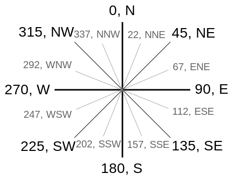
background-image: linear-gradient(205deg, #44443a 0%, #656f66 100%);
If you check the image below, you will see something like 202 degrees and 202 degrees falls around that area.

We set its first color to black with a blend of yellow (#44443a) and its stopping point is 0% which means the color fades from itself to the next color.
The next color is black with a blend of green (#656f66) and its stopping point is 100% which means the first color (#44443a) fades from itself to the next and last color which is (#656f66).
Now, letter-spacing is used to increase the space between/among letters in texts. It is like the space you give letters using space. E.g a y o, opeyemi, E n g l i s h.
You can see the letters have different spacing and that is called letter-spacing in CSS. Now, explain the box-shadow to yourself based on all you have learnt previously.
Also, color: #000; is used to set foreground colour e.g the color of the text in the element.
Step 4: Styling screen memory sign
  .screen-mem {
    font-family: monospace;
    margin-left: 8px;
    color: #000;
    font-size: 20px;
    line-height: 18px;
    visibility: hidden;
  }

.show {
    visibility: visible;
  }
In this case, we will just explain both line-height and visibility. .screen-mem is selected and the line-height of its texts is set to 18px. Then, what is line-height? line-height is commonly used to set the distance between lines of texts. For example,
Line one
Line two
The space between the Line one and Line two is set with line-height using CSS.
Also, visibility:hidden is used to make an element invisible to web page users but such element is still on the page while visibility:visible makes it visible again.
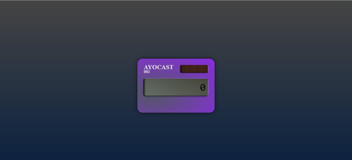
Yeah, that is it and we are done. Below is the final result you should get.

See you in the next tutorial.
