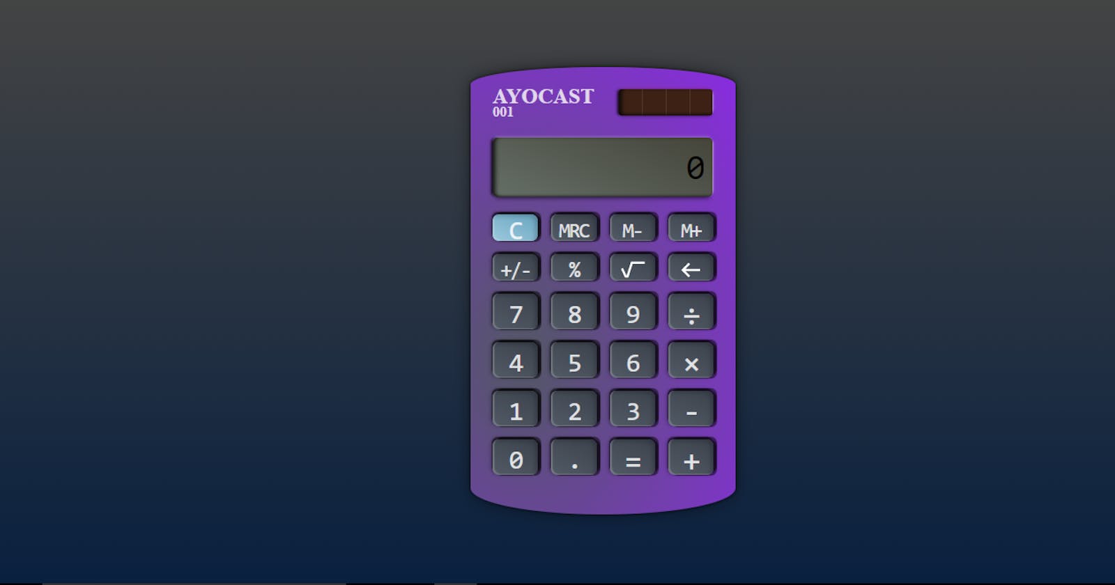
How to build a Calculator with HTML and CSS (part 1)
How to build a basic calculator with HTML and CSS.
Welcome to this lesson which is a part of the series of tutorials to build a Calculator unlike what you have seen before.
In this lesson, we are going to discuss how to make the layout of the calculator with HTML and CSS and you are going to learn how to make a vertical column.
If there is anything you don't understand in this tutorial, that means you probably need to read How to create a two-column layout with HTML & CSS (YouTube Clone - part 1)
So, let's get started.
Breaking down the calculator into units
The first thing we have to do in this tutorial is to break this tutorial down into small units -- meta-information, screen-container, keyboard, screen, button. These are the units the calculator has.
- Meta information contains the name and a description of the calculator.
- Screen-container only contains the screen of the calculator.
Keyboard contains buttons. The buttons of the calculator are almost the same. Some of them are a bit different from others, yet; they are still very similar.
Screen is used to display calculations
Button is used to enter calculation inputs
Now that we have broken the calculator down into pieces, it is time to build the actual calculator with HTML and CSS. We start by building just the layout of the calculator.
Calculator Layout
The layout of this calculator is a three-row-layout, that is, it is a vertical layout that contains three children (elements). So the HTML below contain a calculator element with three children -- meta-information, screen-container and the keyboard (button-container).
<!DOCTYPE html>
<html>

<head>
  <meta charset="utf-8" />
  <meta http-equiv="X-UA-Compatible" content="IE=edge" />
  <title>Calculator</title>
  <meta name="description" content="A real-world like calculator" />
  <meta name="viewport" content="width=device-width, initial-scale=1" />
  <link rel="stylesheet" href="style.css" id="theme" />
  <link href="https://fonts.googleapis.com/css2?family=Open+Sans:wght@300&display=swap" rel="stylesheet" />
</head>
<body class="body">
    <div class="calculator">
      <div class="meta-information">

      </div>
      <div class="screen-container">

      </div>
      <div class="keyboard">

      </div>
    </div>
  </body>
</html>
Yeah! I know... It doesn't look really great when you check the browser. So let's style with CSS to make it more beautiful.
body {
      height: 100vh;
      display: flex;
      align-items: center;
      justify-content: center;
      background-image: linear-gradient(to top, #09203f 0%, #444 100%);
      text-rendering: optimizeLegibility;
    }
height: 100vh means we set the height of body to the total height of the visible part of a website in the browser without scrolling. Then we use "display:flex" to make a layout out of body. We use align-items:center to move all the children of body to the left-center and use justify-content:center to then move all the possible children of the body to the center of the webpage.
Also background-image is used to set the background of images and it can also be used to set gradient for an element.
background-image: linear-gradient(direction, color1 & stopping-point1, color2 & stopping-point2, ...);
In this case, we use it to set a gradient for the body. linear-gradient(to top for gradient direction, #09203f as the first color with 0% as its stopping point, #444 as the second color and 100% as its second stopping point). What does that mean?
It means the gradient would start from the button to the top, and the first color (#09203f) will start transitioning (fading) from 0% of the color up to 100% of the second color(#444). That means it will transition from dark blue to black.
Then we set text-rendering: optimizeLegibility; to inform the browser on how to or the compromise it should make in rendering text. In this case, we set the text-rendering to optimizeLegibility to make it focus on the legibility of texts instead of focusing on rendering speed or precision.
That is all we have to do today and we have been able to create the layout of the calculator with HTML and use CSS to just style the background. You now have something like the below:

We will continue from there in the next lesson...see you soon!
